2.4 柱状图(bar)
学习目标
- 目标
- 应用bar实现柱状图的绘制
- 知道柱状图的应用场景
- 应用
- 电影票房收入绘制
2.4.1 柱状图绘制

需求1-对比每部电影的票房收入
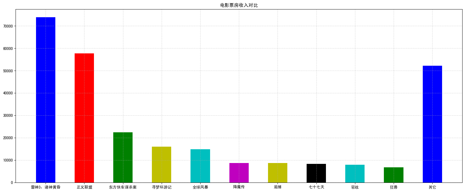
电影数据如下图所示:
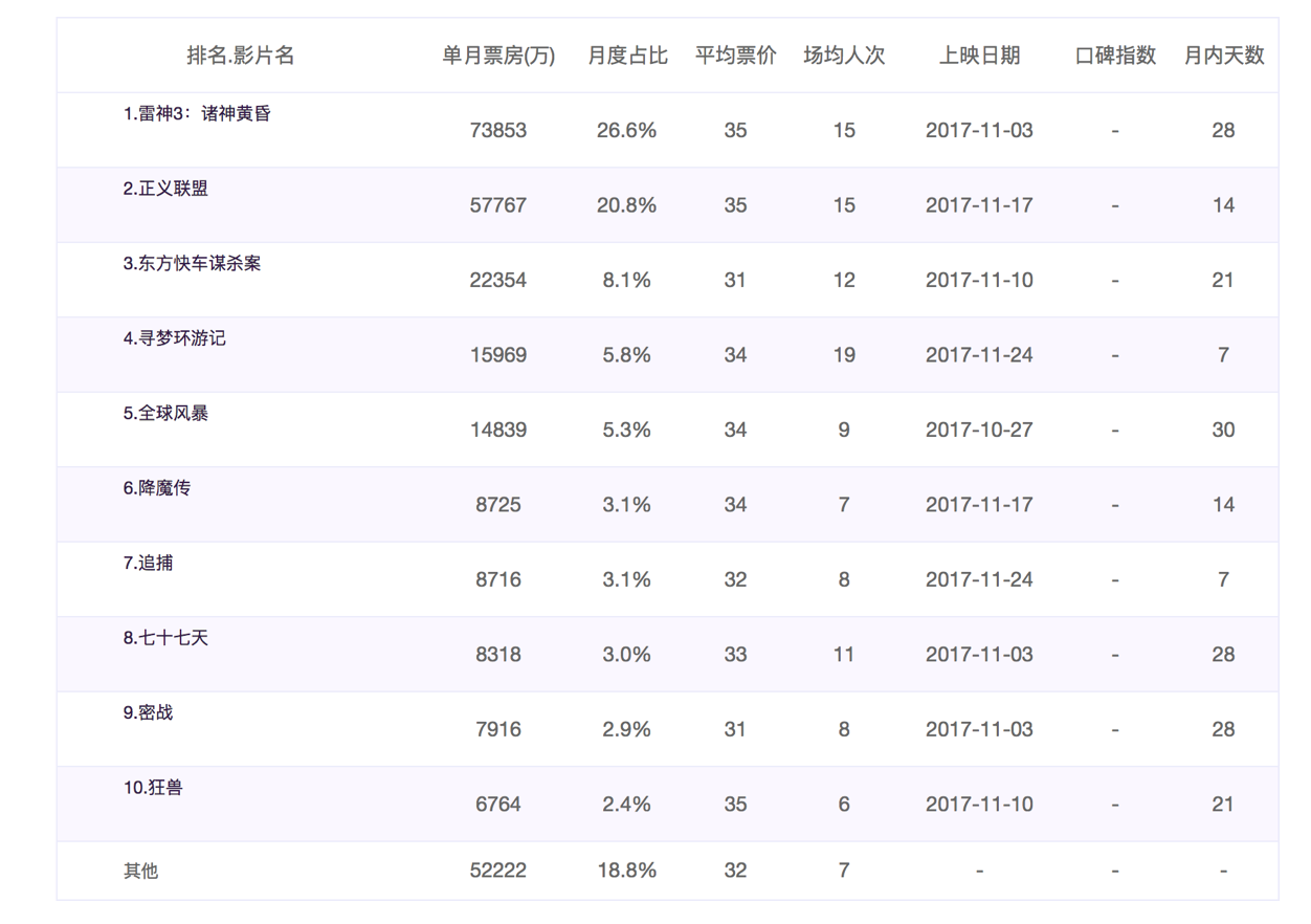
1 准备数据
['雷神3:诸神黄昏','正义联盟','东方快车谋杀案','寻梦环游记','全球风暴', '降魔传','追捕','七十七天','密战','狂兽','其它']
[73853,57767,22354,15969,14839,8725,8716,8318,7916,6764,52222]
2 绘制
- matplotlib.pyplot.bar(x, width, align='center', **kwargs)
绘制柱状图
Parameters:
x : sequence of scalars.

width : scalar or array-like, optional
柱状图的宽度

align : {‘center’, ‘edge’}, optional, default: ‘center’
Alignment of the bars to the x coordinates:
‘center’: Center the base on the x positions.
‘edge’: Align the left edges of the bars with the x positions.
每个柱状图的位置对齐方式

**kwargs :
color:选择柱状图的颜色

Returns:
`.BarContainer`
Container with all the bars and optionally errorbars.
代码:
# 1)准备数据
# 电影名字
movie_name = ['雷神3:诸神黄昏','正义联盟','东方快车谋杀案','寻梦环游记','全球风暴','降魔传','追捕','七十七天','密战','狂兽','其它']
# 横坐标
x = range(len(movie_name))
# 票房数据
y = [73853,57767,22354,15969,14839,8725,8716,8318,7916,6764,52222]

# 2)创建画布
plt.figure(figsize=(20, 8), dpi=100)

# 3)绘制柱状图
plt.bar(x, y, width=0.5, color=['b','r','g','y','c','m','y','k','c','g','b'])

# 修改x轴的刻度显示
plt.xticks(x, movie_name)

# 添加网格显示
plt.grid(linestyle="--", alpha=0.5)

# 添加标题
plt.title("电影票房收入对比")

# 4)显示图像
plt.show()
需求2-如何对比电影票房收入才更能加有说服力?
比较相同天数的票房
有时候为了公平起见,我们需要对比不同电影首日和首周的票房
1 准备数据
movie_name = ['雷神3:诸神黄昏','正义联盟','寻梦环游记']

first_day = [10587.6,10062.5,1275.7]
first_weekend=[36224.9,34479.6,11830]

数据来源: https://piaofang.maoyan.com/?ver=normal
效果如下:
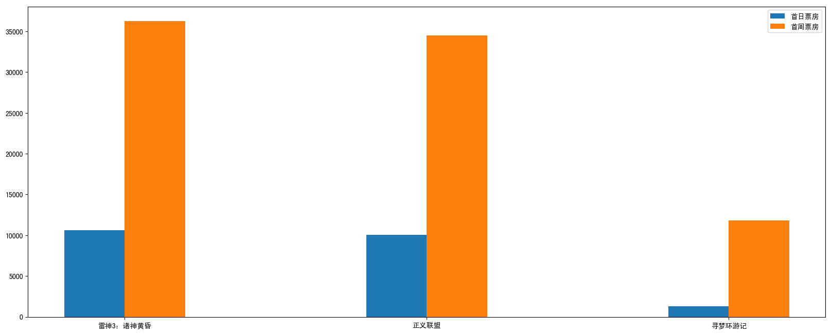
2 绘制
- 添加首日首周两部分的柱状图
- x轴中文坐标位置调整
代码:
# 1)准备数据
movie_name = ['雷神3:诸神黄昏','正义联盟','寻梦环游记']

first_day = [10587.6,10062.5,1275.7]
first_weekend=[36224.9,34479.6,11830]

x = range(len(movie_name))

# 2)创建画布
plt.figure(figsize=(20, 8), dpi=100)

# 3)绘制柱状图
plt.bar(x, first_day, width=0.2, label="首日票房")
plt.bar([i+0.2 for i in x], first_weekend, width=0.2, label="首周票房")

# 显示图例
plt.legend()

# 修改x轴刻度显示
plt.xticks([i+0.1 for i in x], movie_name)

# 4)显示图像
plt.show()
2.4.2 柱状图应用场景
适合用在分类数据对比场景上
- 数量统计
- 用户数量对比分析